Friday 12 February 2016
Note to Moderator
Hello, my name is Emily Cowling and I am an A2 media student at Brigg Sixth Form. I have blogged the entire journey of my music video and ancillary products, from my initial ideas to my final video. I tried to make my creative journey as clear as possible, labelling which posts are research and which posts are planning. In total, I have 114 posts on my blog, including my note to moderator, 4 evaluation questions, my music video, digipak, advert and other promotional media. Leaving 105 research and planning posts. Of the 105 posts, including 62 planning posts and 43 research posts. I hope you enjoy my blog, thank you!
Q1. In what ways does your media product use, develop or challenge forms and conventions of real media products?
Directors Cut A2 Music Video- Sandi Thom Punk Rocker Script
Emily: We used two overlaying shots, one of Indya in the background to introduce the star in a long shot with grungy font added over the top to portray the title of the song and to give it a grungy effect.
Luke: We went against convention by using a blur and we used natural framing through the use of an archway in the background. We used a medium shot of her singing into camera and ken burnsed it into a close up to show her singing.
Emily: We used another blur to fade in between the shots due to the slow rhythm, Indya is right of frame. We also made this shot use motion in the way Indya is swinging in the hammock, and the hammock also brought bright colors into the shot to add to the punk genre.
Luke: We then used a right of frame shot of Indya singing into camera. We used a natural background to connote Indya's natural beauty. We also made Indya wear white clothing as it created the effect of purity.
Emily: This shot ends with an overlaying fade of the next
shot which is a pull focus where the focus starts on the hedge whilst an all-black
effect is overlaid. Then the camera focus goes onto our star.
Luke: The next shot enters with another blur. The shot
itself is a close up of a guitar, it over cranks and Ken Burns.
Emily: We then used a flying cam over the guitar with the
guitar in centre frame.
Luke: The next shot is under cranking of the motorway. The
saturation has been upped for the lyric “Not everybody drove a car” and then
the next shot is a flip footage from the other side of the motorway, just to
break up the two shots.
Emily: The next shot pans from left to right, it’s a wide
shot which shows our star in the middle but she is not looking into camera, we
used this with the sepia tone to adhere to the idea of the memories within the
video.
Luke: The next shot is a low angle shot. Robbie comes in
from the right, gives the impression of power as the camera is adjusted below
along with the posh car.
Emily: The scene then cuts to create continuity editing of
Robbie walking straight across the front of the camera in front of the car. It
gives a perspective of the size of the car and shows of Robbie’s suit connoting
wealth.
Luke: The next shot then cuts to a close up, over the
shoulder shot of Robbie on the phone, it gives the idea of technology and the
idea of technology taking over.
Emily: We then cut to a shot of Indya in punky makeup with
dark lipstick, we also used dark ambiotic lighting to connote the idea of the
punk genre. This is a medium close up of Indya and shows her also putting in
her headphones to link with the previous shot and to link with technology.
Luke: We then used found footage of a punk on a motorbike to
give the idea of nostalgia and we also used an overlay of a matrix style coding
to link to technology.
Emily: We then used a found shot of people from the 80s in
the background, we used green screen and lumar key over the top in order to
create a green screen effect. We under cranked the shot and placed newspapers
over the face to create the idea of the media taking over.
Luke: This then fades to 70s found footage of hippies to
show the clothing and the time period, whilst this occurred, we under played
Indya in the background putting in her headphones again. It gave the impression
of a full circle of continuous shots.
Emily: We then used pull focus again to Indya’s face in a
medium centre frame shot. She wears the leather jacket again to create a punky
impression. We also used a slight low angle to create the impression of her
having power.
Luke: We then used a tracking shot of Indya singing into
camera, with all the extras walking behind her, this creates power as it shows
Indya is in control, this adheres to Propp’s fairy-tale narrative as the extras
appear to be helpers, making her comfortable in herself. We also applied a
flower vignette mask over the top to break convention, it added a feminine
touch and linked to the lyric flowers.
Emily: The scene then cuts to a low angle shot, left of
frame, medium close up of Indya singing into camera, we used boats in the
background to connote the idea of a journey and Indya finding herself.
Luke: We then used a scene with people reading magazines, we
used two quick cut close up shots of different punk magazines and then a close
up over the shoulder shot of Indya reading a magazine, it was done to create
the impression of the media having control over us. We are influenced by what
we read in the magazines.
Emily: We then used a quick, under cranked shot of leaves
going across a bird table, it was done to create the impression of ignorance,
and how the natural setting meant that you were less inclined to be influenced
by what you read in the media, this is because it isn’t everywhere in rural
settings.
Luke: This next shot is Indya in front of a flag of Great
Britain, it’s a medium close up, centre frame of her singing into camera.
Emily: We then used the idea of memories to create
nostalgia, we used a front cover close up of the photo album, and then we used
someone flicking through the pages, we then used a close up of a nostalgic
group photo which then came to life with a slight blur, this created the
impression of memories.
Luke: We then used a paper clip close up, low in saturation
and a continuous shot of the paper clip going through the ear.
Emily: The next shot is a close up of a door knocker, we used
continuity editing to the next shot with the door being open, there is a slight
close up of the letter, and it then goes to the letter being passed across.
Luke: The next shot is a close up of Indya, it goes into
another vignette mask, there is then a cut and a change of location of a low
angle shot of Indya in a man-made frame of a church.
Emily: We then used a medium close up of Indya singing into
camera, we used a natural background along with her bright orange clothing, it
created the impression of her being a bright and happy character.
Luke: We then used a close up, slight high angle looking
down on Indya, it gave the impression of her being fragile and delicate, and we
also upped the saturation on the shot to make it brighter.
Emily: We then used three close up shots of records, two of
these were under cranked, and I added a sepia tone over this, it created the
impression of nostalgia and linked to the idea of records being part of the
punk era, and they are not used anymore.
Luke: We used an under cranked shot of the motorway filmed
at a high angle to give a full view of the motorway, we also added mist over
the top to create the impression of history. This shot was kept at full motion.
Emily: We then used a close up shot of Indya’s boots, we
used a bright background to have happy connotations, and we also used the boots
tapping to link to the song, this is because it matched the beat.
Luke: We then used lots of under cranked shots of a football
match, we also made these handheld to give the impression that we were actually
there, and we also added a sepia tone over the top to give the impression of it
being a memory. We also used a slight low angle shot of the football crowd, we
made this spontaneous, we made this look as though they were having fun, and it
also made the shot look much more natural.
Emily: We then cut back to the boot tapping on the beat with
the bright background to create happy connotations.
Luke: We then used a Ken Burnsed shot, starting in a medium
shot and going into a medium close up, we used Indya looking through an
abandoned building window, it created the impression of memories and a time
that has gone by. It created the impression of her yearning for the past.
Emily: We then used a medium shot, low angle of Indya
singing in the sunlight, the coloring in the sunlight was similar to the
colour of her t-shirt and it created synergy. It gave the impression of Indya
becoming happy with herself and the time that she is in, we also centre framed
it to show Indya as the most prominent character.
Luke: We then used a close up of Indya singing with darker
makeup on at a low angle, once again it made Indya more powerful and gave the
impression of the Punk Era, we also used the dark tree to give a rustic appearance
and we used a centre frame shot.
Emily: We then used a wide shot of Indya framed right and we
used lots of flowers, there was also a slight pull focus which made Indya
really prominent, the flowers adhered to the idea of femininity and made a link
between the punk era and now through the dark makeup and bright colours.
Luke: We then used quick cuts of four of our performance
shots with a sepia tone, it finished off the idea of memories and made the
whole music video appear as a flashback, it also showed Indya’s development
throughout the music video.
Emily: Finally we used a shot of Indya in a medium close up,
left of frame, it was Indya wearing dark makeup as we threw balloons over the
top of her, and the balloons had bright colours and gave the impression of
freedom.
Luke: Within our video we adhered to Barthes, we used two
indexical signs, the idea of flowers and the safety pins, the flowers gave the impression
of flowers and femininity whilst the safety pin linked to the idea of the punk
era, we also used the rural setting in our video to enhance how feminine Indya
is. We also used the cultural idea of feminism. Everyone follows Indya and she
is allowed to make up her own mind. We also adhered to Vladimir Propp, with the
idea of a villain, on a metaphorical level, society is the villain. The modern
day stops her from being who she wants to be, we also used extras with this,
the extras help Indya to realise that she can be happy with who she is.
Emily: We also used Todorov, our music video starts in
disequilibrium and Indya isn’t happy with the punk era and doesn’t know whether
she can be in it, society is stopping her, this ends in equilibrium when Indya
accepts who she is thanks to the help of her friends and memories. We also used
Strauss binary opposition, we used the idea of the punk era contrasted with the
modern era and we also used society’s perception of good and bad: being a good
girl and a rebel are contrasted. In accordance to Bordwell and Thompson, our
narrative follows Indya wanting to be a punk, however she can’t and she is
yearning for a time gone by. In accordance with Cameron’s four types of
narrative, we used the idea of flashbacks in our video to create the idea of
nostalgia and memories.
My Codes and Conventions Journey From AS to A2
Over my transition from AS to A2, I feel that my skills and understanding of real media texts has developed significantly. At AS, I produced a front cover, double page spread and contents pages for an Indie magazine, whereas at A2, I created an indie music video and a promotional package for our star.
The majority of production at AS was done using Photoshop elements 11. However, I also used a bridge camera in order to get the shots I needed for my magazine. I chose to use a close up shot of my star "Bander". This adhered to convention and Laura Mulvey's male gaze theory. I was heavily influenced by Bjork- Wire Edition's front cover, in which a close up shot of Bjork is used. I liked that these created a form of personal address, it felt as though Bjork was looking directly at you. Upon reflection, I feel that this convention worked well for my magazine, my star appeared to look voyeuristic yet powerful. This would therefore appeal to males due to the voyeurism, and females due to the feminist feel of the magazine. However, if I'd have had the confidence to break convention at AS, i feel that I could have created a much more dynamic and interesting image- living up to the "unique" masthead.
Within AS, another convention I broke was the audience that I chose to reach with my magazine. The majority of music magazines aim to reach a mass market. However, upon reflection I feel that my creative decisions meant that I achieved a look which would be much more attractive to a niche market- a higher class university market. I feel that one of the reasons for this was the influence that "Bite" magazine had on my work. I liked the minimalist appearance and serif font. This meant that when it came to producing my magazine, I used lots of different serif fonts and sizes. Although this meant I adhered to convention, the serif font had an upper class connotation to it. Upon reflection, I don't feel that my magazine would have been attractive to media producers such as Bauer as they aim to reach a wider audience in order to make higher profits. By breaking convention and meeting a niche market, my work may not have been as financially viable as it could be in the modern world.
Whereas at A2, I feel my journey had made me much more comfortable with technology and conventions, I felt more confident and coincidentally wasn't as worried about breaking convention as I was at AS.
However, there were certain elements that I needed to adhere to in order to adhere to the promotional package element of my brief. One of these conventions was the notion of singing into camera which appeared across the majority of music videos and genres, from "All American Rejects- Give You Hell" to "Train-Marry Me". Upon reflection, I feel that this convention worked brilliantly for my music video, it gave viewers an insight into our star's brand identity. I felt that this would make our audience want to look into our star's music and brand more. We needed to use this convention in order to establish our star.
As much as I adhered to convention, I felt I broke more. For instance, one of the conventions I broke was my use of studio shots- there was none. I felt that I mainly chose to do this due to the regional identity of our star. By using lots of shots of greenery, it heightened the rural identity of our star and made it a much more prominent feature of her identity. Another music video that influenced me to do this was "The Rumble Strips- Girls and Boys"- I felt that by doing this it made the indie genre of our music video much more prominent. Upon reflection, I feel my unconventional use of rural shots heightened Indya's regional identity and made the music genre much more prominent.
Another genre convention I broke was the use of archive footage in my music video. I didn't see this in any other video I researched. I chose to do this as I wanted to create a direct link to the genre Indya was discussing in the video. This also adhered to Kate Wales' theory "Genre is an inter textual concept". By doing this, it also established my music video as post modern which requires an active audience. It is argued that more and more films and music videos are entering an active and post modern era- people want to read into what they are watching. Upon reflection I feel that the archive footage meant we could widen our target market and create a music video with social impact.
Emily Cowling's Slidely Gallery by Slidely Photo Gallery
Q2. How effective is the combination of your main product and ancillary product?


Media evaluation from cowlinge
Additional Ancillary Products:
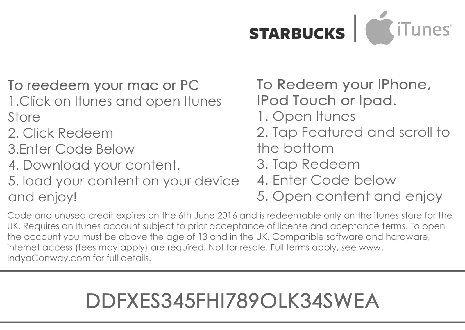
Alongside my promotional package, I wanted to create a Starbucks downloadable card, this is because the idea of coffee shops and new music are typical conventions associated with the Indie Genre. I also know that Starbucks is popular with our generation, and as that was our target market I felt that the Starbucks promotion card really would aid to promote our star- even though this wasn't in the brief. I wanted to include this as it would influence me to listen to similar artists.
In order to create synergy with this promotional media as well, I chose to use the same font I had used across my digipak and advert- the font "Must Print Clearly" which I downloaded of 1001 free fonts. I used this font as I felt that it looked professional and was an easy font to read. I also made some parts of this font green to create synergy with the rural settings used across both my music video and promotional package.
Finally, in order to create a direct link with our artist, I used the front cover of our digipak, this is as it could be directly associated with Indya and it gave our audience an insight into Indya's character and the sort of music she would be singing. Promoting our star further.


Additional Ancillary Products:
Alongside my promotional package, I wanted to create a Starbucks downloadable card, this is because the idea of coffee shops and new music are typical conventions associated with the Indie Genre. I also know that Starbucks is popular with our generation, and as that was our target market I felt that the Starbucks promotion card really would aid to promote our star- even though this wasn't in the brief. I wanted to include this as it would influence me to listen to similar artists.
In order to create synergy with this promotional media as well, I chose to use the same font I had used across my digipak and advert- the font "Must Print Clearly" which I downloaded of 1001 free fonts. I used this font as I felt that it looked professional and was an easy font to read. I also made some parts of this font green to create synergy with the rural settings used across both my music video and promotional package.
Finally, in order to create a direct link with our artist, I used the front cover of our digipak, this is as it could be directly associated with Indya and it gave our audience an insight into Indya's character and the sort of music she would be singing. Promoting our star further.

Thursday 11 February 2016
Q3. What have you learned from your target audience feedback?

Q4. How did you use media technologies in the construction, research, planning and evaluation stages?
How I created a vignette mask on Final Cut Pro X

1. First of all, you open up your project on Final Cut Pro X, the project we are currently working on is or music video to Sandi Thom Punk Rocker.
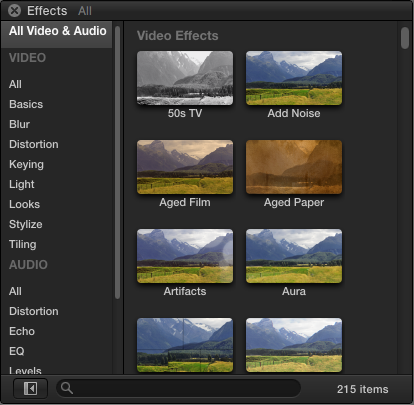
2. You then scroll across two the effects browser which is in the bottom hand right corner, this features lots of effects to use on your music video, such as Lumar Key, Aged Paper etc. However, the one that I am looking for is the Vignette tool.

3. To find the vignette mask tool, I searched for "Vignette" in the search engine right in the bottom right of the page- I then looked for this icon, when I hover my mouse over the icon, it comes up with a preview of what the footage will look like on the screen.

4. I then added the vignette mask onto my time line over the clip that I wanted it to be on, as you can see at first, the vignette mask is only slight and doesn't have an image over layed onto it, this is the next step we need to work on.

5. Then, you go to the right of frame at the top of Final Cut Pro X, this features a list of editing tools which you can use to edit your vignette mask.

6. This was it when I first added it to my timeline. In order to adjust this, I upped the blur amount, and increased the size of the vignette mask, I left the darken and the "fall off" tool the same. Resulting in this screen on my Final Cut Timeline. The black is where I am going to overlay my image.

7. I then added in an earlier shot I did of flowers in my garden, I wanted to this to be the vignette as it added a floral and feminine touch to the shot- it is also an unconventional aspect of music videos.

8. I then made this shot into a freeze frame as when I replayed the clip there was a slight movement from the camera, by adding a freeze frame I was able to make a still of the shot, I also cropped the image slightly to get rid of the green in the bottom right hand corner, this would mean that the full vignette mask would be made solely of flowers.

9. I then went on to put the flower image underneath the tracking shot on my timeline, the two clips were also connected once I had done this. This means that the two clips are locked together, and I can't move one clip without moving the other.

10. This was the finished result when I added the vignette mask to the clip, I also further blurred the vignette mask in order to create a gradual effect from the outline to the interior of the shot without it being to sharp. I feel that if I had left the clip sharp, it would have lost the femininity within the shots


In order to develop our creativity, myself and my partner decided to create a short bloopers/ production video of all of the humorous clips within our production and of any shots that included us filming. I also thought that this would give you an insight into the journey we went through and how we selected and rejected certain shots. I have to admit, some are slightly cringey!
Wednesday 10 February 2016
Tuesday 9 February 2016

Sunday 7 February 2016

Wednesday 3 February 2016


Wednesday 13 January 2016


Monday 11 January 2016


Monday 4 January 2016
Planning: Which publisher would we need to approach to advertise in Q?
Bauer is a European based publisher whos headquarters are in Hamburg- they manage 600 magazines, 400 digital products and 50 different TV and Radio stations. This would therefore give us massive space to advertise our video and artist in order to promote her better.
Q is one of their most successful magazines- who advertise mainly indie, pop and rock music. Our music video and artist hits two of those genres- and is singing an incredibly popular song in pop culture that is easily recognized and remembered.
However, due to Bauer's size and scale, it may be difficult for use to achieve recognition by the company- we may have to work on a smaller scale first and then build up to working with Bauer.
Planning: Where would our music video be advertised?

The singer who originally sung our song, Sandi Thom- is also an incredibly popular artist from around 10 years ago- her music went viral. Hence, Sandi Thom already has a massive fan base and Sandi Thom has also been featured in Q magazine- people reading the magazine may recognize the song title- and hence then go and listen to our music video.
Planning: Indya-Punk Rocker Target Audience Feedback Questionnaire 5
Questionnaire 5
Did you like the locations used within the music video?
I think there was a nice range of locations that linked really well with Indya's star image
Do you think that we met our target audience (13-17)?
Yes, the use of colors and extras worked within the video, really linked with the TA
Do you believe that Indya was a convincing star?
Yes, she suited the song well
In your opinion do you think we used enough shots? why?
Yes there is a nice range of shots with various locations, although performance could get repetitive
What was your favorite shot of the music video? why?
the last shot with the balloons was a really nice ending to the video, I also liked the time lapse
which transition did you prefer? cuts or blurs?
I liked the combination of the 2
Did you understand the concept of our video?
Yes, expressing feelings towards what she wants to be
Was the makeup effective throughout the piece?
Yes
Planning: Indya Punk Rocker- Target Audience Feedback- Questionnaire 4
Questionnaire 4
Did you like the locations within the music video?
Suited star- not sure about boats ?! low angle shot (box in background) implies shes not strong enough to rebel
Do you think that we met our target audience (13-17)?
Yes- Possibly older too as some older TA may recall the era
Do you believe that Indya was a convincing star image?
Yes- well synced, She seemed very happy and positive connotations were created
In your opinion did we use enough shots? Why?
Yes, one shot seemed a little long, intertextuality with archive footage is interesting
What was your favorite shot in the music video? why?
Tracking back as Indya led the group forward, photo into action, brick arch frame
Which transition did you prefer? Cuts or blurs?
Faster cuts yet the blurs/ cross dissolves work well in the slower shots
Did you understand the concept of our music video?
Desire/ nostalgia for a period long gone
Was the makeup effective throughout the piece?
Innocent- white shirt/ scarf work well with the natural environment, black jacket which was the punk rocker, the development of makeup works
Planning: Indya- Punk Rocker target audience feedback- Questionnaire 3
Questionnaire 3
Did you like the locations within the music video?
The locations were well used and I liked them
Do you think that we met our target audience (13-17)?
The target audience was well met
Do you believe that Indya was a convincing star?
Yes, she looks like a good performer
In your opinion do you think we used enough shots? why?
There was a wide range of shots and they were all effective
What was your favorite shot of the music video? why?
At the start next to the bush and she walks past
Which transition did you prefer? blurs or cuts?
Cuts, but the blurs worked well when the song was slower
Was the makeup effective throughout the piece?
Yes, there was nothing over the top
Planning: Indya- Punk Rocker Target Audience Feedback- Questionnaire 2
Questionnaire 2
Did you like the locations used within the music video?
Yes, they worked will with the song lyrics and there was a large variety of them
Do you think that we met our target audience (13-17)?
Yes, it had a range of shots and mise en scene which can be eye catching to the TA
Do you believe that Indya was a convincing star?
Yes, gave a good performance and worked well with the song
In your opinion do you think we used enough shots? why?
There is a large variety and they have all worked for your MV
What was your favorite shot in the music video? why?
The use of the pull focus! the shots were effective and I liked them
Which transition did you prefer; cuts or blurs?
I think both worked well for the MV
Did you understand the concept of our video?
Yes, shes trying to find herself but can't
Was the makeup effective throughout the piece?
I'm not sure, however it worked well and showed the feminine side of the star
Planning: Indya-Punk Rocker Target Audience Feedback- Questionnaire 1
Questionnaire 1
Did you like the locations used within the music video?
Yes, they were well chosen and went with her clothes
Do you think we met our target audience (13-17)?
Yes, definitely!
Do you believe that Indya was a convincing star image?
Yes, her expressions throughout were good and linked well to the song
In your opinion do you think we used enough shots? Why?
Yes, your shots were enough and fit well with the speed of the song
What was your favorite shot of the music video? Why?
The football game!
Which transitions did you prefer; cuts or blurs?
Blurs
Did you understand the concept of our music video?
Yes, a girl trying to portray her feelings on what she wants to be and how she feels about it.
Was the makeup effective throughout the piece?
Yes it was natural and suited the locations
Saturday 12 December 2015
Planning: using the blogger app
In order to keep up with my media blog, and access it quickly and easily- I downloaded the blogger app- it meant I could access my blog 24/7 
Planning: using intertextuality
Within our music video, we have used intertextuality in the form of replicating one of the ideas from the original music video, we tracked Indya as she was singing, walking into camera in the same way that Sandi Thom did in her music video, We did this in order to heighten the sense of nostalgia- and the idea of bringing something from the past into the modern era- Sandi Thom's music video is around 10 years old- and we have tried to bring the ideas back! 

Wednesday 9 December 2015
Planning: Discrepancies during the burning of our disk


Tuesday 8 December 2015
Planning: Draft for inside cover of the DigiPak


Friday 4 December 2015
Planning: Using 70's tv footage of mods and rockers- and news broadcasts


Subscribe to:
Posts (Atom)